Color and quality

Primary colors

RGB - Screen

The primary colors - red, green, blue (RGB) - are mixed to create all available colors.

A color is created by mixing light in these colors in a certain amount.

When all three are lit at the same time at full brightness, the resulting light turns white.

An example is the screen and the TV. Thus, a light source is needed.

Secondary colors

CMY - Paper

The secondary colors - Cyan, Magenta, Yellow (CMY) - are mixed to create colors.

In everyday language, we call Cyan turquoise and Magenta purple.

This model is based on absorption / reflection of light. Ex: Light falls on a piece of paper. Some colors are reflected up to your eye, while others are absorbed by the paper.

When all three exist simultaneously, the result is black.

Printing on paper is an example of subtractive color.

As we can see, there are two different ways to make colors.

Primary colors (colors that light up) that we see on the screen when we sit and edit our images in Photoshop.

Secondary colors (colors that are not lit) that are on printed paper.

Color space

What the eye can see

The circle above corresponds to the color space that a human eye can see.

The white color space corresponds to what a normal screen can render of visible colors.

The inner black color space shows roughly what a hard copy can reproduce for color.

Paper vs screen

Therefore, the colors of my copy will not be the way I experience them on screen.

You can compare it to peeling an orange.

When we take the orange (the white color space) and peel away the bright orange peel, the smaller orange orange (the black inner color space) remains. You can say that you peel off the color peaks that glow on a screen, to a paper that does not glow.

When you go from the larger color space down to the smaller one that contains a hard copy, you peel away many shades.

This may make the paper feel a little flatter. 

  • Adobe RGB

Lundeby, as a professional image producer, wants to have image files with Adobe RGB to offer the best possible quality. Most image manufacturers work in the Adobe RGB color space, which has more color information than the S-RGB color space. 

  • sRGB

S-RGB is the color space most monitors can display, making S-RGB the best fit for the web. One tip is to convert images to S-RGB if they are to be used online or sent to customers. 

CMYK is a much smaller color space than Adobe-RGB, this is a color space used for printing. 

Convert photos back and forth!

If you convert an image from a larger profile down to a smaller e.g. CMYK or sRGB, remove information in the image. If you convert back to Adobe RGB again, you will get a worse result, because you already removed information when you converted down to a smaller profile.

Tip: Many cameras can be set to take pictures in Adobe-RGB! 

Photo print

Adobe RGB

Lundeby has a machine park with the best printers on the market, they print with up to 11 colors on real photo paper that gives the best color reproduction.

With the color profile Adobe-RGB we get an even and good result.

This is "High quality". 

Digital printing

Adobe RGB (machine converted to CMYK)

Lundeby also has a digital printing department, with the latest machines on the market.

When it comes to printing, it is done in four colors (CMYK) and on paper or cardboard.

This is a color space smaller than Adobe RGB.

To keep color control as good as possible, the machines convert Adobe-RGB to CMYK.

Therefore send us pictures with Adobe-RGB for digital printing as well. 

s-RGB

We are constantly expanding the possibilities and the machines are updated, we have recently improved the conversion of sRGB files, but the quality can never be as good as with Adobe RGB.

If you are submitting sRGB files, please write it in the comments section!

(Then we convert manually) 

Wrong profile

If we receive files with "wrong" color profile, e.g. S-RGB, the conversion will not be correct and the colors will not be as expected. This is due to that there are not enough colors / shades, e.g. there is a depth of green / yellow.

The opposite pole to green is Magenta (red), which means that when you reduce with green (sRGB), the image becomes redder. (Often darker with color imbalance, this is most noticeable on Digital Printing). This is rarely seen on the screen, but the printout shows a clear difference

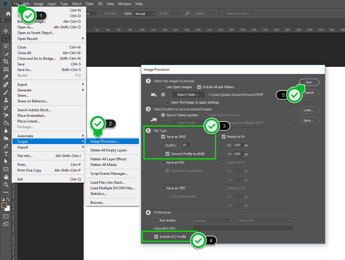
When we print an image on Digital Print in CMYK where we suspect the wrong color profile, we convert it in the printing process to sRGB, which results in a good result ... but not fully like Adobe-RGB.

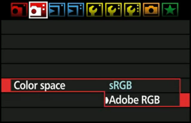
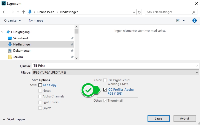
NB! It is important that the image file has the correct color profile, so it is not enough if you "mount" the image in another program e.g. Illustrator or Indesign that has Adobe RGB as the color profile in the document. The actual image you mount must also have Adobe RGB. 

Test your color vision

Black and white photos on color paper.

When it comes to black and white images, they easily get a splash of color. It is impossible to always get a perfect gray balance as there are four colors that match together to the right shade. When the color space is smaller, the steps become much larger between shades. This color gamut is rarely noticed on a color image, but in the grayscale you will notice it.

For digital printing, you can add some red (Magenta) to the black and white images to avoid green stings.

The black and white image may also be perceived as having a color gamut depending on the color of the display light.

If you look at a black and white image in daylight and go indoors from fluorescent lamps to incandescent lamps, the image goes from green light to red light. 

Camera profile

Set the camera to shoot in Adobe RGB profile.

Edit photos

Upload and edit the images, save them in Adobe RGB for print.

Convert images to web

Convert the images to sRGB for web use, for example to the website and social media. Also so that your customers can see and share online.

Calibrated monitor

The last important thing is to see the right colors on your screen. There are various monitors and calibration equipment. (We strongly recommend Eizo monitors that are very good at displaying a wide range of colors such as Adobe RGB).

To check that your screen reproduces the correct colors, it is a good idea to have a reference, such as a color copy, that you can compare with the same image on your screen. You can send in a picture in eg 20 × 30 as a reference copy to us. Choose an image with many colors and shades (And remember to save properly with Adobe RGB). This is useful to do for both you and us, and we do it for free!

View the reference image in normal indoor daylight and make sure the screen is not surrounded by bright light or strong colors.